
Yes. As long as overflow: hidden is used (or the image is a background one), the border-radius will clip the image cleanly.

Border Radius Generator
Adjust each corner independently or all at once, preview the shape live, and copy the CSS.
What the Border Radius Generator Does
There are a few things that can make a design look soft without much hassle, and rounded corners are definitely among them. However, typing the border-radius values manually can become a trial-and-error process: change a value, refresh the browser, try again, and so on. The Border Radius Generator on Tool Flora eliminates the guesswork — you see a live preview and adjust each corner with its own slider.
How to Use the Border Radius Generator
Generating the shape requires only a few seconds:
- Open the Border Radius Generator page.
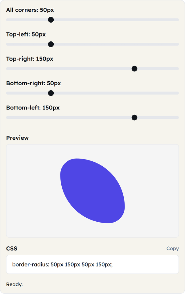
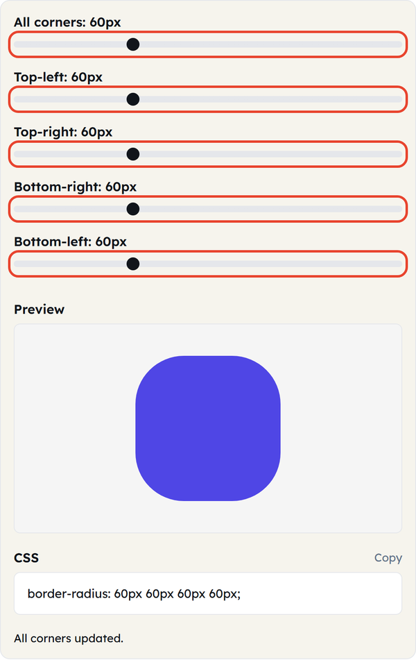
- Use the All corners slider to round every corner equally, or move the Top-left, Top-right, Bottom-right and Bottom-left sliders separately for an uneven shape.
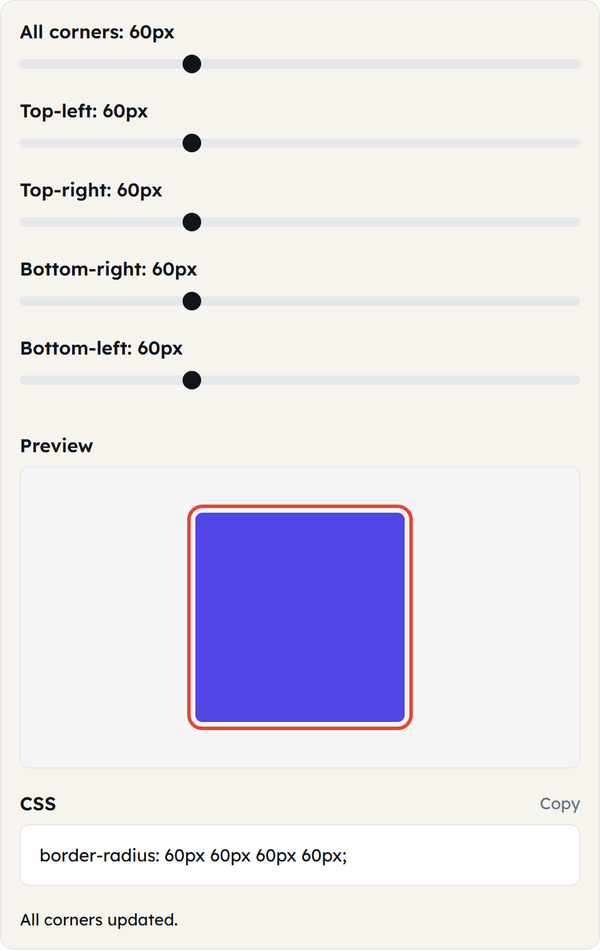
- The Preview box reflects every slider move immediately.
- Click Copy when you like the shape to copy the generated CSS.
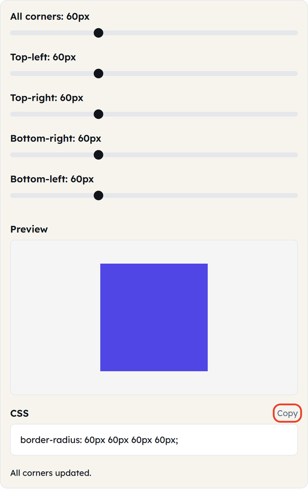
- Paste the copied CSS into your stylesheet.
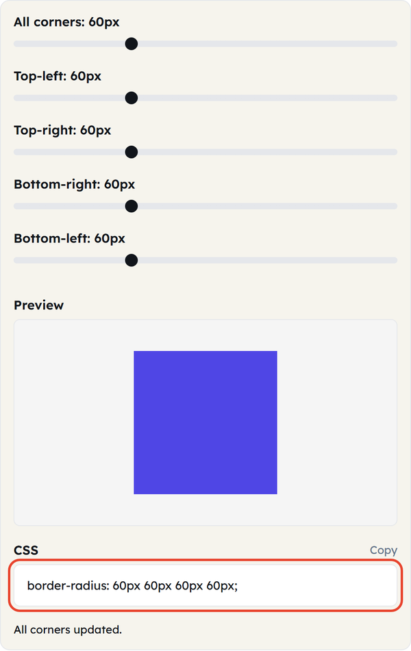
No registration, no software to download, everything is done inside the browser.
What Is border-radius?
Border-radius is the CSS property that allows rounding the corners of the element’s box. Rather than having sharp 90-degree angles, this property makes it possible to control the curvature of each corner and set its radius in pixels, percent or any other unit of CSS measurement. It is also possible to set one value for equal rounding of all four corners and separate values for each of the corners using border-top-left-radius, border-top-right-radius, border-bottom-right-radius, and border-bottom-left-radius.
When You’d Use This
Border-radius appears everywhere in daily web design practices:
- Buttons and Cards – Rounded corners make buttons more approachable and friendlier compared to sharp ones.
- Avatars and Profile Pictures – Applying the value of 50% makes any square picture round.
- Modal windows and Tooltips – This property adds smoothness and softness to pop-ups.
- Form Fields – Rounded form fields are widely used in contemporary design systems.
- Custom shapes – Different values for each corner can be used for creating custom forms that represent speech bubbles, blobs, or any unusual design for a card.
If you develop a design system or improve the landing page, this feature can help you determine how your final product will look without coding one CSS line.
Do’s and Don’ts
Do:
- Use consistent radius values in comparable elements (buttons, cards, etc).
- Use percentage values in your own CSS when the rounding should depend on the element’s size.
- Check whether your rounded element looks good in various sizes.
Don’t:
- Push huge radius values onto tiny elements — you may end up with cramped text or icons.
- Forget that overflow: hidden may be necessary when rounding an element that contains an image or a background color.
- Mix a variety of radius values around the page arbitrarily; it may result in a visually inconsistent design.
Good to Know
- A border-radius value greater than half the size of the element will be automatically limited, so don’t hesitate to specify very large radius values to force circle or pill shape.
- You can write two values per corner in raw CSS (a horizontal and a vertical radius) for elliptical corners, but the Tool Flora generator sticks to the single-value form most designers need.
- Border-radius property is supported by all major browsers, thus you don’t need any vendor prefixes here.
FAQ
Does border-radius apply to background images?
Can I create a button with an oval or pill shape?
Yes. Just use a very large value (for instance 999px) in relation to the height of your button, and you’ll get a completely round pill shape.
Does it matter whether pixels or percentages are used?
Pixel values give a predictable curve no matter the element size, while percentages scale with the size of the element itself.
Does it work on mobile devices?
Yes. The generator is fully responsive and works in any modern browser on either a mobile or desktop device.
Related Tools

Color Picker
Pick colors and copy HEX, RGB, or HSL values.
- 100% Free
- Customizable
- Download
- Unlimited

Gradient Generator
Build CSS gradients with live preview.
- 100% Free
- Customizable
- Download
- Unlimited

Box Shadow Generator
Design layered box shadows visually.
- 100% Free
- Customizable
- Download
- Unlimited

Contrast Checker
Check WCAG contrast between two colors.
- 100% Free
- Customizable
- Download
- Unlimited