
Yes, absolutely free with no registration needed.

Box Shadow Generator
Craft a CSS box-shadow with sliders for offset, blur, spread, color and opacity — with a live preview and copy-ready code.
What the Box Shadow Generator Does
Getting a box-shadow to have that ‘perfect’ look when styling with CSS usually requires fiddling with several numbers, then refreshing the browser to try again, and again, until something magical happens. It’s tedious work that often results in a shadow that is too harsh, too blurry or positioned oddly. This is where the Box Shadow Generator shines: it gives you a slider for every parameter that shapes a box-shadow, provides a live preview on a sample card, and produces finished CSS you can copy straight into your stylesheet.
When styling a button, a card element, a modal or simply giving that ‘lift’ to an image — this generator comes in handy.
How to Use the Box Shadow Generator
Here is the process of using the tool:
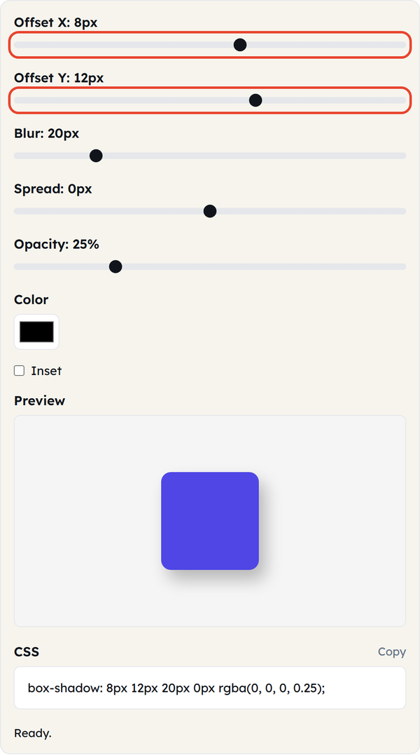
- Change Offset X and Offset Y — Offset X and Offset Y are used to shift the shadow to the right or left, to up or down. The positive numbers shift the shadow right and down, while negative numbers shift the shadow left and up.
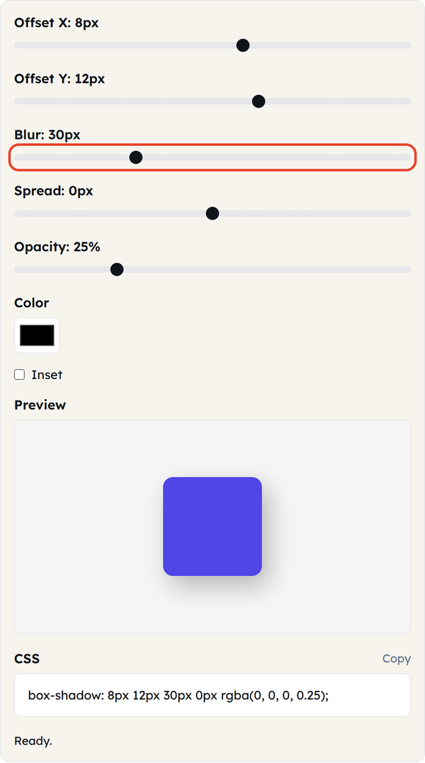
- Change Blur — use this option to soften the edges of the shadow. When a high blur value is set, the shadow becomes diffused and looks like a soft glow. A low blur value will keep the shadow sharp.
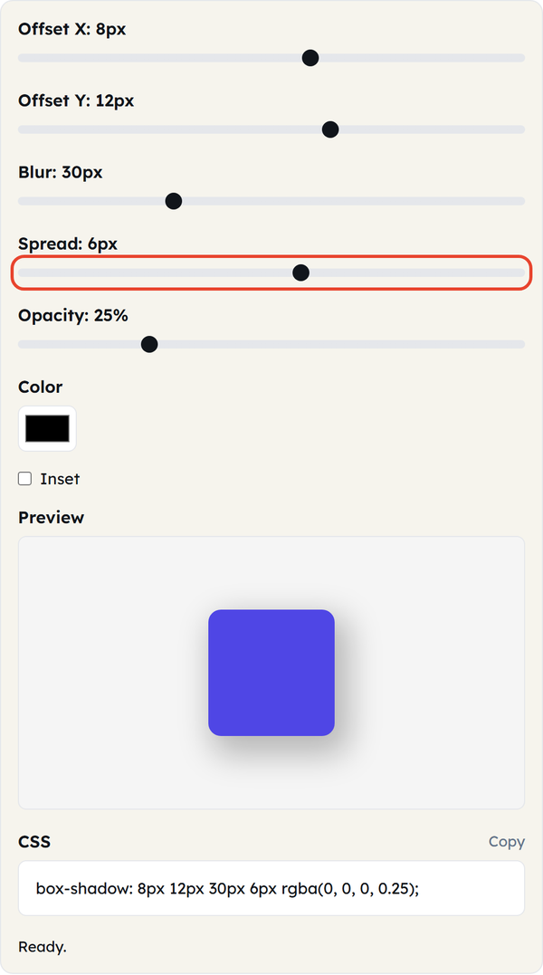
- Change Spread — this option is used to make the shadow larger or smaller in relation to the object that it follows.
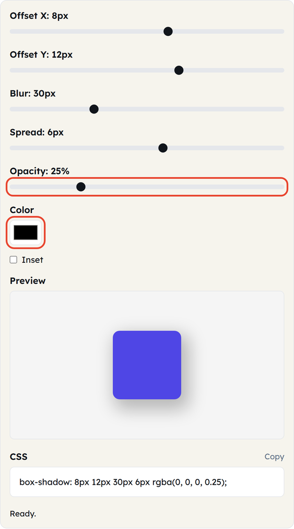
- Pick the shadow Color and set Opacity — how solid or transparent the shadow looks.
- Check the Inset checkbox if you need the shadow to be inside the element.
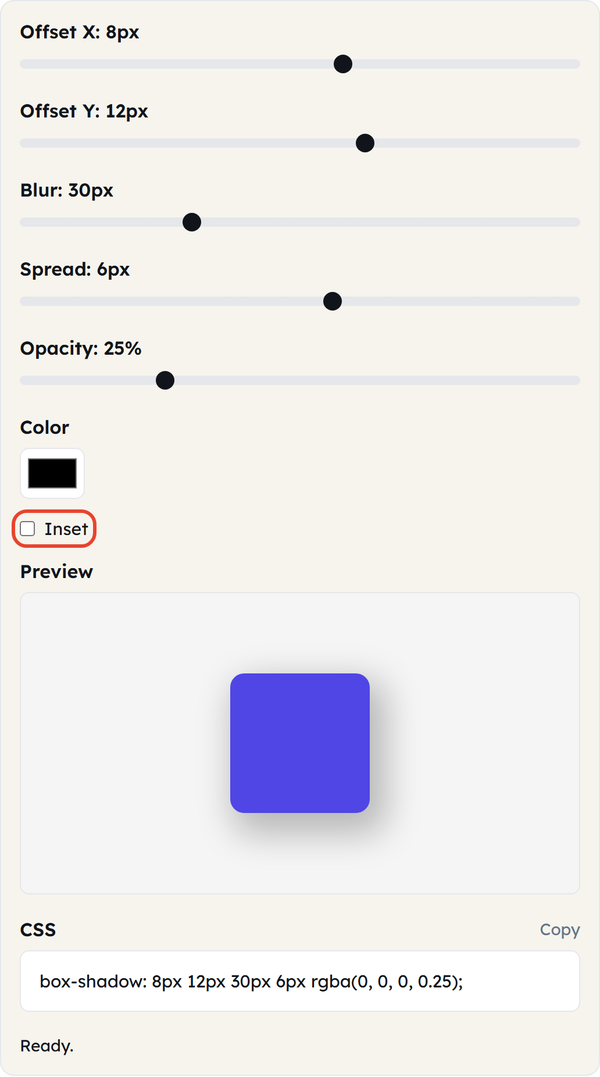
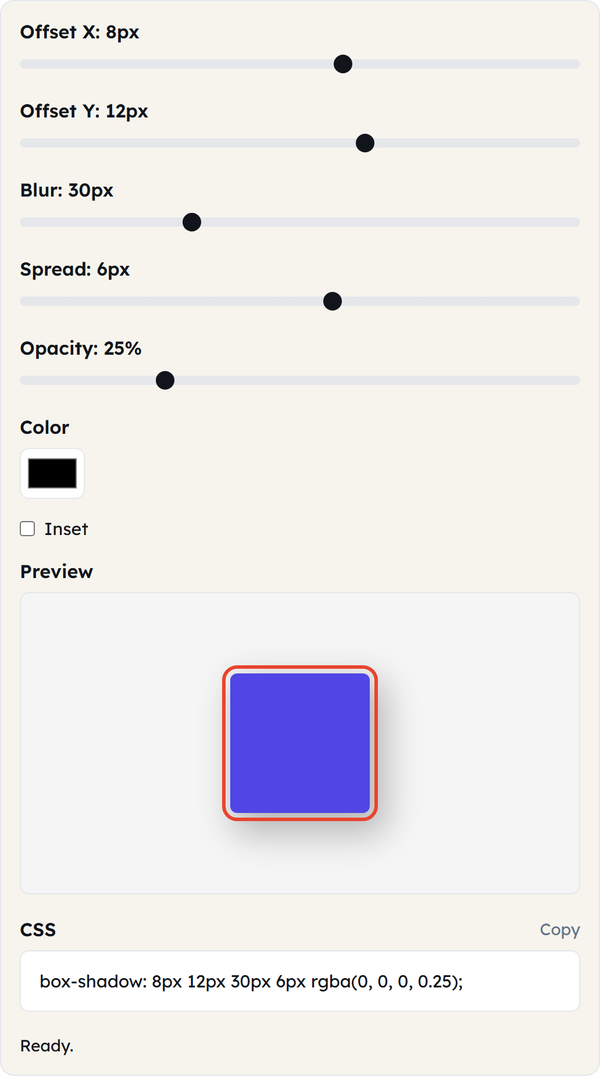
- Use live preview feature to see how the changes affect your result immediately after you move sliders.
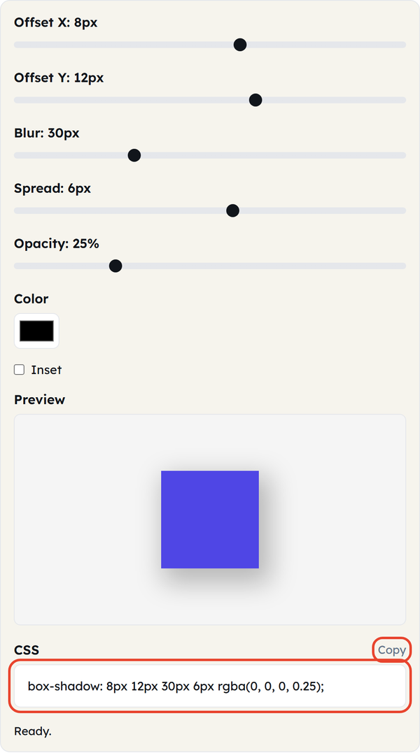
- Click Copy to grab the generated CSS from the CSS box.
What Is box-shadow?
Box-shadow is a CSS property that draws a shadow around an element’s frame. It takes the following values: horizontal offset, vertical offset, blur radius, spread radius, and color:
box-shadow: -2px 10px 20px 0px rgba(0,0,0,0.25);The sliders in the generator correspond to each value above that defines the specific aspects of the shadow visual. You may apply several shadows to one element by comma separation when needed.
When You’d Use This
Box-shadow is a frequently used feature in contemporary website design. Some typical application scenarios for box-shadow are:
- Buttons and cards — creating slight depth to make elements look like they can be pressed or appear raised.
- Modal windows and popups — making an overlay look different from its background content.
- Inputs in forms — displaying states of being focused with the help of a subtle glow.
- Framing images — creating a border effect around images or thumbnails without adding actual borders.
If you are working on a design system or only polishing a landing page, this feature will allow you to define proper values of shadows rather than choosing some random pixels.
Do’s and Don’ts
Do:
- Opacity should be low (10–30%) for realistic shadows.
- Keep blur moderate — excessive blurring makes shadows look muddy.
- Test the shadow on light and dark backgrounds before settling on its design.
- Inset shadows should be used rarely, usually for form fields or pressed states.
Don’t:
- Pile up many shadow layers on one element — it can hurt performance and look messy.
- Use black at high opacity because it will look more artificial than realistic.
- Overlook testing of the shadow on mobile devices, where subtle details may become invisible.
Good to Know
- The box-shadow property does not influence the positioning or spacing of an element – it is only applied visually.
- The support for box-shadow is great in all modern browsers, so there is no need to use vendor-specific prefixes.
- The CSS that is produced by the tool is ready to use, and no additional formatting is necessary.
FAQ
Is the Box Shadow Generator free?
Can I apply several shadows to a single element?
The tool produces one layer at a time; for multiple shadows, generate each layer separately and join the CSS values with commas in the right order.
Does inset have any effect on offset, blur, or spread properties?
No — inset doesn’t change offset, blur or spread; it just draws the shadow inside the element’s border.
Will the generated CSS work in all browsers?
Yes, box-shadow is a widely supported CSS property in all browsers.
Related Tools

Color Picker
Pick colors and copy HEX, RGB, or HSL values.
- 100% Free
- Customizable
- Download
- Unlimited

Gradient Generator
Build CSS gradients with live preview.
- 100% Free
- Customizable
- Download
- Unlimited

Border Radius Generator
Tune corner radii and copy ready CSS.
- 100% Free
- Customizable
- Download
- Unlimited

Contrast Checker
Check WCAG contrast between two colors.
- 100% Free
- Customizable
- Download
- Unlimited