
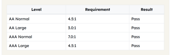
WCAG AA, the most often recommended standard, states that there should be a minimum contrast ratio of 4.5:1 for normal text and 3:1 for large text. WCAG AAA, the highest standard, has 7:1 for normal text and 4.5:1 for large text.

Contrast Checker
Check the WCAG contrast ratio between text and background colors, with a live sample and Pass/Fail results.
Compare any text and background color against WCAG AA and AAA standards with this free contrast checker, and instantly find the contrast ratio of your text and background and check if your combination passes or fails.
Contrast between text and background is one of the most basic accessibility needs on the web; often a text that appears perfect on the designer’s high-end monitor can appear extremely difficult to read to someone with low vision, color blindness, or even a phone screen in bright sunlight. This contrast checker compares any foreground to background color combination to the official WCAG AA and AAA guidelines, for regular and large text and provides instant pass or fail.
How to Use the Contrast Checker
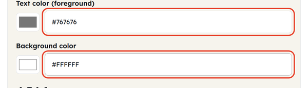
- Set your two colours. Each has a swatch you can click and a hex box you can type or paste into – use whichever is quicker.
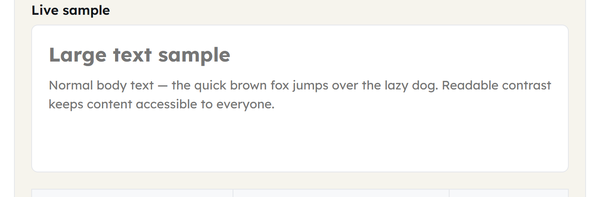
- Read the contrast ratio displayed, and review the actual sample text to verify the contrast.
- Read the results table: AA Normal, AA Large, AAA Normal and AAA Large, each with its required ratio and a Pass or Fail against your pair.
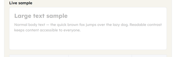
- The ratio and pass/fail results will update instantly when you adjust either color, so you can adjust the palette until you get the pass/fail result you want.
What Is Contrast Ratio, and What Do WCAG AA and AAA Require?
Contrast ratio is the ratio of brightness, such as 4.5:1 (lighter color to darker color), that exists between two colors. The highest possible contrast is 21:1 (black to white), and the lowest possible contrast is 1:1 (no contrast—colors are the same).
The Web Content Accessibility Guidelines (WCAG) define a minimum contrast ratio; this varies according to the size of the text and the level of accessibility desired:
| Requirement | Minimum ratio |
|---|---|
| AA — Normal text | 4.5:1 |
| AA — Large text | 3.0:1 |
| AAA — Normal text | 7.0:1 |
| AAA — Large text | 4.5:1 |
| AA — Graphics & UI components (WCAG 2.1) | 3.0:1 |
The most frequently cited standard is AA, which is what most accessibility laws and organisational policies point at. AAA is stricter and usually treated as a target rather than a requirement. Large text means 18 point and above at regular weight, or 14 point and above when bold – anything smaller has to meet the normal text requirement instead. WCAG 2.1 added a separate, lower requirement of 3:1 for graphical objects and interface elements such as form input borders and icons.
When You Would Use This
A contrast check is worth running in a few situations:
- Building a website and choosing a text and background pair.
- Checking a whole colour palette for accessibility before you commit to it.
- Handing button, link or form-field colours to a client, or preparing for an accessibility audit.
- Checking a brand’s colour combinations against the standards referenced by accessibility law.
- Double-checking interface colours against the lower 3:1 threshold for graphics and UI components.
Do’s and Don’ts
Do:
- Try out your actual background and text colors, not only an approximation – small changes in color can make the difference between passing or failing.
- If you use both normal and large text, check results in each separately: A heading might need a different color pair than body text.
- Aim for AAA where you reasonably can, especially on primary body content, even when only AA is strictly required.
Don’t:
- Assume a pair that looks fine to you is readable for everyone – your eyesight and your screen are not the test.
- Neglect to review UI elements (such as buttons, form borders, icons) against their own, lower 3:1 ratio as it is a different standard to text contrast and can be easily missed.
- Use color to imply meaning (e.g., text that is only red to indicate an error) – contrast is one aspect of accessible design, not another accessible pattern such as icons or text labels.
Good to Know
Contrast is not only a compliance box to tick – it decides whether people can actually read your content, whether they have low vision or colour blindness, or are simply dealing with glare, an ageing monitor or a dim room. A useful mental anchor: pure black on pure white is 21:1, and every requirement is really asking how close to that maximum you need to get. Note too that AA and AAA are separate levels rather than the same test at two strengths, so passing one tells you nothing about the other – check whichever level you are held to. Everything on this page runs locally in your browser; no colours are sent or stored.
Frequently Asked Questions
What is a good contrast ratio for accessibility?
What counts as “large text” under WCAG?
Large text is text that is 14 point (about 18.66px) and bold or larger, or 18 point (about 24px) and larger regular weight.
Why does color contrast matter for accessibility?
A good contrast will help everyone to better see text and interface elements, particularly those with low vision or color blindness, and for purposes of situational contrast, such as with screen glare.
What is the maximum possible contrast ratio?
The maximum contrast ratio is 21:1 between pure black text on a pure white background (or vice versa).
Do UI components and icons need the same contrast ratio as text?
The lower WCAG 2.1 requirement of 3:1 contrast ratio for graphical objects and user interface components, including form input element borders, is less than the 4.5:1 requirement for AA normal text.
Are the colors I enter stored or sent anywhere?
No. The contrast calculation is done purely in your browser and no colors are transmitted or stored.
Related Tools

Color Picker
Pick colors and copy HEX, RGB, or HSL values.
- 100% Free
- Customizable
- Download
- Unlimited

Gradient Generator
Build CSS gradients with live preview.
- 100% Free
- Customizable
- Download
- Unlimited

Box Shadow Generator
Design layered box shadows visually.
- 100% Free
- Customizable
- Download
- Unlimited

Border Radius Generator
Tune corner radii and copy ready CSS.
- 100% Free
- Customizable
- Download
- Unlimited