
Apply the linear-gradient() function to the background or background-image property with an angle followed by two or more colours, for example: background: linear-gradient(90deg, #ff5733, #33c1ff);

Gradient Generator
Design linear and radial CSS gradients visually with color stops, then copy the ready-to-use CSS.
Use this free CSS gradient generator to design linear and radial gradients visually, adjusting the angle and the colour stops as you go, then copy clean, ready-to-use CSS straight into your project.
One of the easiest ways to add depth without loading an image file is with gradients, but manually creating these gradients is tricky, especially for those with no coding experience, as getting the angle, placement of color stops, and syntax correct is not that easy. This CSS gradient generator does it visually: create as many color stops as you require, see the gradient preview in real time, and copy the clean and production-proof CSS code exactly when you’re ready with the gradient.
How to Use the CSS Gradient Generator
- Select the type of the gradient (Linear — colors transition along a straight line or Radial — colors transition outward from a central point).

- Drag the angle slider to set the direction the colours run. It covers 0 to 360 degrees and hides itself when you switch to radial, where it does not apply.

- Add and position your colour stops: + Add stop appends another, each stop has its own colour swatch and a percentage position, and the x beside a stop removes it.

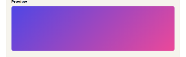
- Watch the preview redraw as you change the type, angle, colours and positions – there is no button to press.
- Click Copy to copy the CSS code that was generated and paste it right into your stylesheet.

What Is a CSS Gradient, and How Does the Syntax Work?
A CSS gradient is a smooth, code-generated blend between two or more colors that is applied to a background image value — that is, it’s used as a background image, but doesn’t need to be loaded from any image file, scales perfectly at any size, and looks crisp on any screen resolution.
Linear gradient syntax:
background: linear-gradient(90deg, #ff5733, #33c1ff);
This combines two colors from #ff5733 to #33c1ff in straight line, at a 90-degree angle. Direction is controlled by the angle:
- 0deg — from bottom to top
- 90deg — left to right
- 180deg — top to bottom
- Note that 270deg is opposite to 90deg, which is right to left.
Radial gradient syntax:
background: radial-gradient(circle, #ff5733, #33c1ff);
- This expands radially from a central point in a circle, instead of a line — great for spotlighted effects or a soft glow behind content.
- Adding more colors: You can add any number of color stops separated by a comma and each one can optionally contain a position percentage so you can precisely determine where you want that color to be placed in the blend:
- background: linear-gradient(90deg, #ff5733 0%, #ffbd33 50%, #33c1ff 100%);
- One minor point to be familiar with: banding. Banding is a slight visible striping that may occur from time to time in a gradient, particularly when the gradient is large and/or contains a mixture of colors between specific color combinations. Gradient banding appears as visible bands instead of a smooth color transition. It can depend on the colors, gradient size, display, and rendering environment. Adding an intermediate color stop may sometimes create a smoother-looking transition, but it is not a guaranteed fix.
When You Would Use This
A gradient generator earns its place in a few common situations:
- Building a page, hero section or card background without loading an image file.
- Giving a button, badge or UI element a subtle colour transition.
- Matching a brand gradient from a design mock-up.
- Prototyping a colour scheme before committing it to code.
- Getting a live preview instead of guessing at angle and colour-stop values by hand.
Do’s and Don’ts
Do:
- Add an intermediate colour stop if a long or subtle gradient shows visible banding rather than blending smoothly.
- If an element already has other background settings that you want to preserve, consider using background-image instead of the background shorthand, since background can reset other background properties.
- Try to preview the gradient at the same size it will be displayed in — so a gradient that is okay in a small preview box may look different at a larger size in a hero section.
Don’t:
- Assume that adding more color stops will always improve a gradient. Use additional stops only when they create a smoother or more intentional transition.
- Forget that a radial gradient takes the shape of its container – if the box is not square you get an ellipse rather than a circle.
- Use vendor-prefixed syntax (such as -webkit-linear-gradient) — all current major browsers support a standard CSS gradient syntax.
Good to Know
Because a gradient is generated by code rather than loaded from a file, it has no resolution limit and stays crisp at any size or zoom level – which is why they turn up everywhere in modern interfaces. CSS defines three gradient types: linear, radial and conic. This generator covers linear and radial; conic gradients sweep colour around a central point and suit colour wheels and pie-chart effects. If a gradient shows banding rather than a smooth blend, that is a rendering quirk rather than a mistake in your code: adding an extra stop near the middle of the transition often helps, though it is not guaranteed to remove it. Everything on this page runs locally in your browser – nothing you create is sent or stored.
Frequently Asked Questions
How do I write CSS for a linear gradient?
What’s the difference between a linear and a radial gradient?
A linear gradient blends colours along a straight line in a direction you set with an angle. A radial gradient spreads outward from a central point in a circle or ellipse instead.
How do I add more than two colors to a gradient?
Inside the gradient function, place other color stops, with their color and optional position percentage, separated by commas. CSS gradients can have any number of color stops.
What does the angle value in a linear gradient mean?
The angle determines the direction of the flow of the gradient in degrees. 0deg is pointing up (bottom to top), 90deg is pointing to the right (left to right), 180deg is pointing down (top to bottom), and 270deg is pointing left (right to left).
Why does my gradient show visible stripes instead of a smooth blend?
That is banding, and it shows up most in very large gradients or between certain colour combinations. Adding an intermediate colour stop near the midpoint usually smooths the blend, though it does not always remove it completely.
Will a CSS gradient work in all browsers?
Yes. Every major browser supports linear and radial gradients using the standard CSS syntax, so no vendor prefix is needed.
Related Tools

Color Picker
Pick colors and copy HEX, RGB, or HSL values.
- 100% Free
- Customizable
- Download
- Unlimited

Box Shadow Generator
Design layered box shadows visually.
- 100% Free
- Customizable
- Download
- Unlimited

Border Radius Generator
Tune corner radii and copy ready CSS.
- 100% Free
- Customizable
- Download
- Unlimited

Contrast Checker
Check WCAG contrast between two colors.
- 100% Free
- Customizable
- Download
- Unlimited